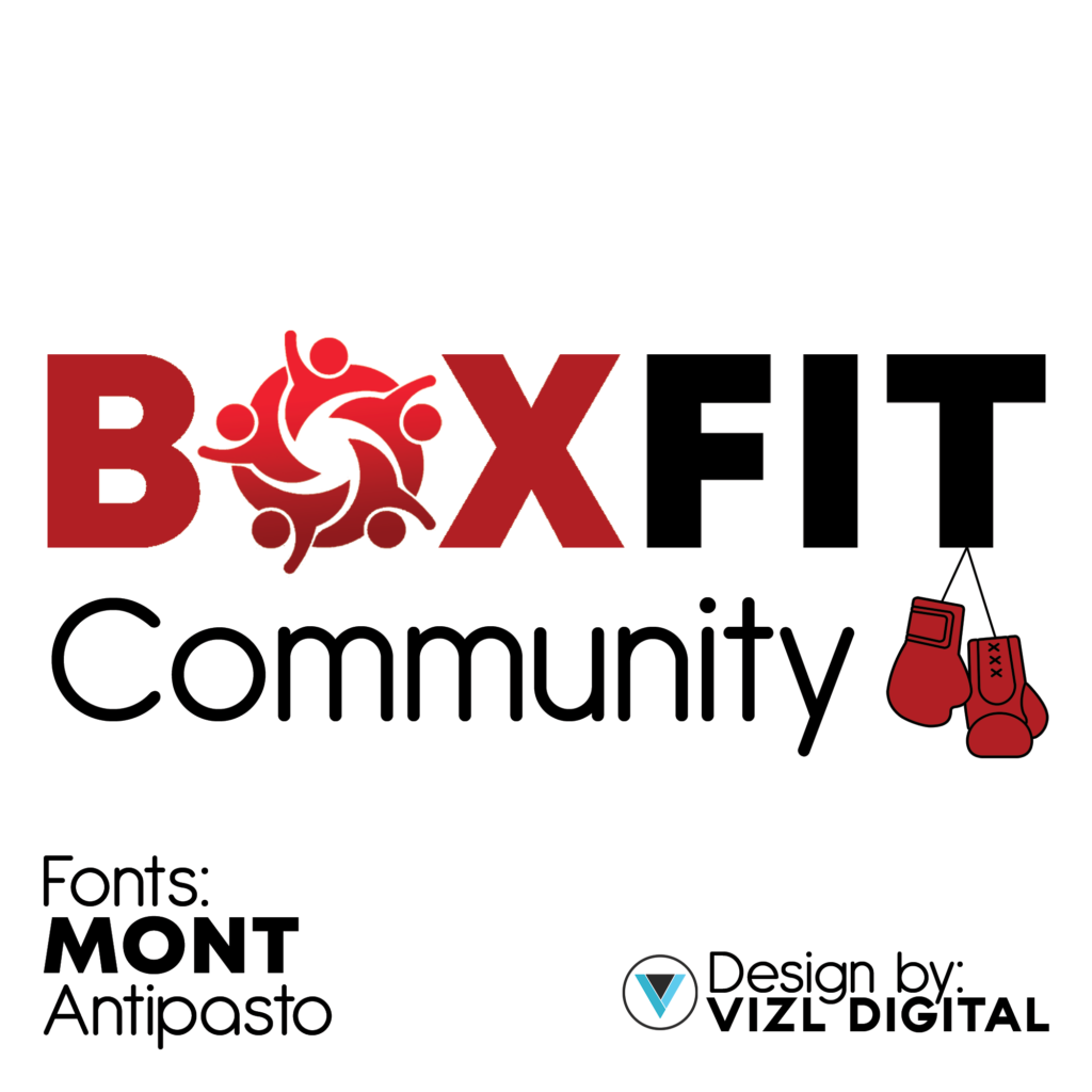
Crafting this emblem was a labor of love, blending artistry with purpose. Inspired by BoxFit’s vision of inclusivity and vitality, I meticulously sketched and refined, seeking the perfect balance of form and function. The highlight? The ‘O’ in ‘Box’ – a circle of vibrant stick figures, each hue representing the diverse tapestry of our community. Through countless iterations and thoughtful feedback, the design evolved, culminating in a symbol that not only captures BoxFit’s essence but also resonates with every member of our fitness family